Understanding Color
Not for the faint of heart, this page attempts to explain technical details about color.
Warning: This page is highly technical.
Those of us who are average users can happily go on our way without worrying about the technical details of color. Much like a modern automobile with all kinds of electronics, a bunch of smart engineers made driving "turn-key" simple. So, for those of us who just want pictures to print, we recommend you continue your care-free life, and not worry about the pesky details that follow. This page gets into some technical details that you really don't need to worry about unless you are an image professional.
A very common question we receive is "do I use CMYK or RGB for my images and files?"
The short answer is: If you upload an interior PDF (i.e. front and back cover are separate files) with all images and artwork converted to CMYK, you will incur the least amount of image alteration in the production work flow.
However, this is a problem: computers require RGB and printers require CMYK.
There are two ways to make colors:
Well, everything in the projection world (computer monitors, TV's, cinemas, etc.) is RGB because viewing devices use a black screen, and need to add light to create color. However, paper is white, so printers need to remove light to create color. Thus the great conflict of digital printing: You design on an additive device (the monitor), but you print on a subtractive device (the printer).
Boy, that's a pain. So why not just convert between two and be done with it? Oh, if it was only that easy... and this is where things get really technical.
In order to create a full range of colors, you need several pieces:
A color model is the method used to make the colors for your image. In grade school, the color model used several jars of paint that you swirled together. In digital devices, a color model is a mathematical formula that will generate colors based on input parameters. So far, we have generally talked about the CMYK and RGB color models which are the most common.
The total possible colors you can create with your color model is known as the color space. The colors in the color space that can be created by a device is called the "gamut". An ICC Profile is standard file type used to define the gamut for a given device.
Where the trouble starts is the CMYK color model cannot produce as many colors as the RGB color model.
There are three primary color spaces used in printing and digital publishing:
In the figure above, you can see a chart that graphs the color spaces for CMYK, sRGB, and AppleRGB. Each line encircles that possible colors for each color space. Note how much smaller the CMYK color space is! CMYK is particularly poor at recreating greens and purples. Looking at the graphs, you can see how much trouble there can be when you need to print colors that are outside of the color space (this is called "out of gamut".)
Just like we have many spoken languages, there are many color languages or "color spaces" as they are called. And much like translating a spoken language, translation between color spaces is not exact. Every language has unique words that do not correspond to other languages, and thus some guessing and judgment is needed when making the translation.
As an example, let's think of the French language. It has a set of rules, and vocabulary of words that are used to produce the language. The "sRGB Color Space" has a set of rules that create the available colors. Translating from French to German requires care to convert words and phrases that do not directly correspond. Similarly, translating from sRGB to generic CMYK requires care to convert colors that do not directly correspond.
In order to translate properly, the translator needs to be properly told the exact color space of the source image, and the desired color space to be translated. There are many variations of RGB, much like dialects of French, each with their own nuances.
If you have made it this far, you must be a pro. So there is only one issue to resolve, and that is the white point. As anyone who has tried to choose a paint color knows, there are thousands of different "whites". With a lot of simplification, a white point is the point on the graph above that color space considers is "true" white. Notice the blue and green dots in the center of the graph? Those represent the white point for the AppleRGB and sRGB color spaces, respectively. This difference in ideas of what is "white" can cause much trouble.
Danger! Notice how the entire AppleRGB is shifted toward blue? This can result in a heavy blue tint to images, particularly monochrome images. If you convert a file created with the AppleRGB profile to the CMYK, but you use wrongly state the source color space as sRGB, you will see this blue tint because the translator had the wrong understanding of what is true white.
For non-commercial services with the same quality, visit our Presto Photo <a href="https://www.prestophoto.com/help/Understanding+Color">Understanding Color</a> page!
Those of us who are average users can happily go on our way without worrying about the technical details of color. Much like a modern automobile with all kinds of electronics, a bunch of smart engineers made driving "turn-key" simple. So, for those of us who just want pictures to print, we recommend you continue your care-free life, and not worry about the pesky details that follow. This page gets into some technical details that you really don't need to worry about unless you are an image professional.
RGB or CMYK?
A very common question we receive is "do I use CMYK or RGB for my images and files?"
The short answer is: If you upload an interior PDF (i.e. front and back cover are separate files) with all images and artwork converted to CMYK, you will incur the least amount of image alteration in the production work flow.
However, this is a problem: computers require RGB and printers require CMYK.
Comparing Colorspaces: Additive vs. Subtractive
There are two ways to make colors:
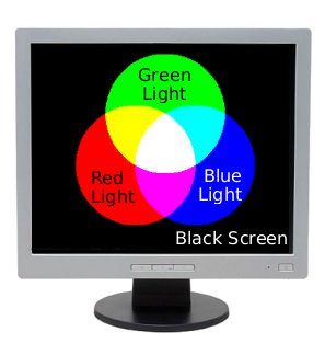
- Start with a black sheet, and use the 3 primary colors until you get white, and every color in-between. This is called the "additive" color model because you are starting with no light (black) and adding light to create color. This is how the RGB colorspace creates colors.
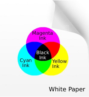
- Start with a white sheet, and use 4 basic colors until you get black, and every color in-between. This is called the subtractive colorspace because you are starting with pure light (white) and covering it up until there is none (black). This is how the CMYK colorspace creates color.
"Well, why isn't everything just in RGB? (or CMYK?)"
Well, everything in the projection world (computer monitors, TV's, cinemas, etc.) is RGB because viewing devices use a black screen, and need to add light to create color. However, paper is white, so printers need to remove light to create color. Thus the great conflict of digital printing: You design on an additive device (the monitor), but you print on a subtractive device (the printer).
 |  |
Computer displays use the additive color space because they start with a black canvas | Printers use the subtractive CMYK color space because they start with a white canvas |
Boy, that's a pain. So why not just convert between two and be done with it? Oh, if it was only that easy... and this is where things get really technical.
How to Make a Rainbow
In order to create a full range of colors, you need several pieces:
A color model is the method used to make the colors for your image. In grade school, the color model used several jars of paint that you swirled together. In digital devices, a color model is a mathematical formula that will generate colors based on input parameters. So far, we have generally talked about the CMYK and RGB color models which are the most common.
The total possible colors you can create with your color model is known as the color space. The colors in the color space that can be created by a device is called the "gamut". An ICC Profile is standard file type used to define the gamut for a given device.
Where the trouble starts is the CMYK color model cannot produce as many colors as the RGB color model.
There are three primary color spaces used in printing and digital publishing:
- CMYK (There are several permutations including US Web Coated SWOP, Generic CMYK)
- sRGB - The new standard for digital devices
- AppleRGB - Actually created by Adobe for early Apple Macintosh computers, this is still the primary color space used for Macintosh computers.
In the figure above, you can see a chart that graphs the color spaces for CMYK, sRGB, and AppleRGB. Each line encircles that possible colors for each color space. Note how much smaller the CMYK color space is! CMYK is particularly poor at recreating greens and purples. Looking at the graphs, you can see how much trouble there can be when you need to print colors that are outside of the color space (this is called "out of gamut".)
The Language of Color
Just like we have many spoken languages, there are many color languages or "color spaces" as they are called. And much like translating a spoken language, translation between color spaces is not exact. Every language has unique words that do not correspond to other languages, and thus some guessing and judgment is needed when making the translation.
As an example, let's think of the French language. It has a set of rules, and vocabulary of words that are used to produce the language. The "sRGB Color Space" has a set of rules that create the available colors. Translating from French to German requires care to convert words and phrases that do not directly correspond. Similarly, translating from sRGB to generic CMYK requires care to convert colors that do not directly correspond.
In order to translate properly, the translator needs to be properly told the exact color space of the source image, and the desired color space to be translated. There are many variations of RGB, much like dialects of French, each with their own nuances.
The White Point at the End of the Tunnel
If you have made it this far, you must be a pro. So there is only one issue to resolve, and that is the white point. As anyone who has tried to choose a paint color knows, there are thousands of different "whites". With a lot of simplification, a white point is the point on the graph above that color space considers is "true" white. Notice the blue and green dots in the center of the graph? Those represent the white point for the AppleRGB and sRGB color spaces, respectively. This difference in ideas of what is "white" can cause much trouble.
Danger! Notice how the entire AppleRGB is shifted toward blue? This can result in a heavy blue tint to images, particularly monochrome images. If you convert a file created with the AppleRGB profile to the CMYK, but you use wrongly state the source color space as sRGB, you will see this blue tint because the translator had the wrong understanding of what is true white.
Useful Links
- A history of the Apple RGB Color Profile, which was actually created by Adobe.
- A Review of RGB color spaces
For non-commercial services with the same quality, visit our Presto Photo <a href="https://www.prestophoto.com/help/Understanding+Color">Understanding Color</a> page!
